designing off menu
/The design process is one of my favorite things when it comes to launching a new brand. There’s something creatively cathartic about selecting colors, fonts, and logos for a website and I never get tired of the back-and-forth between myself and the designer.
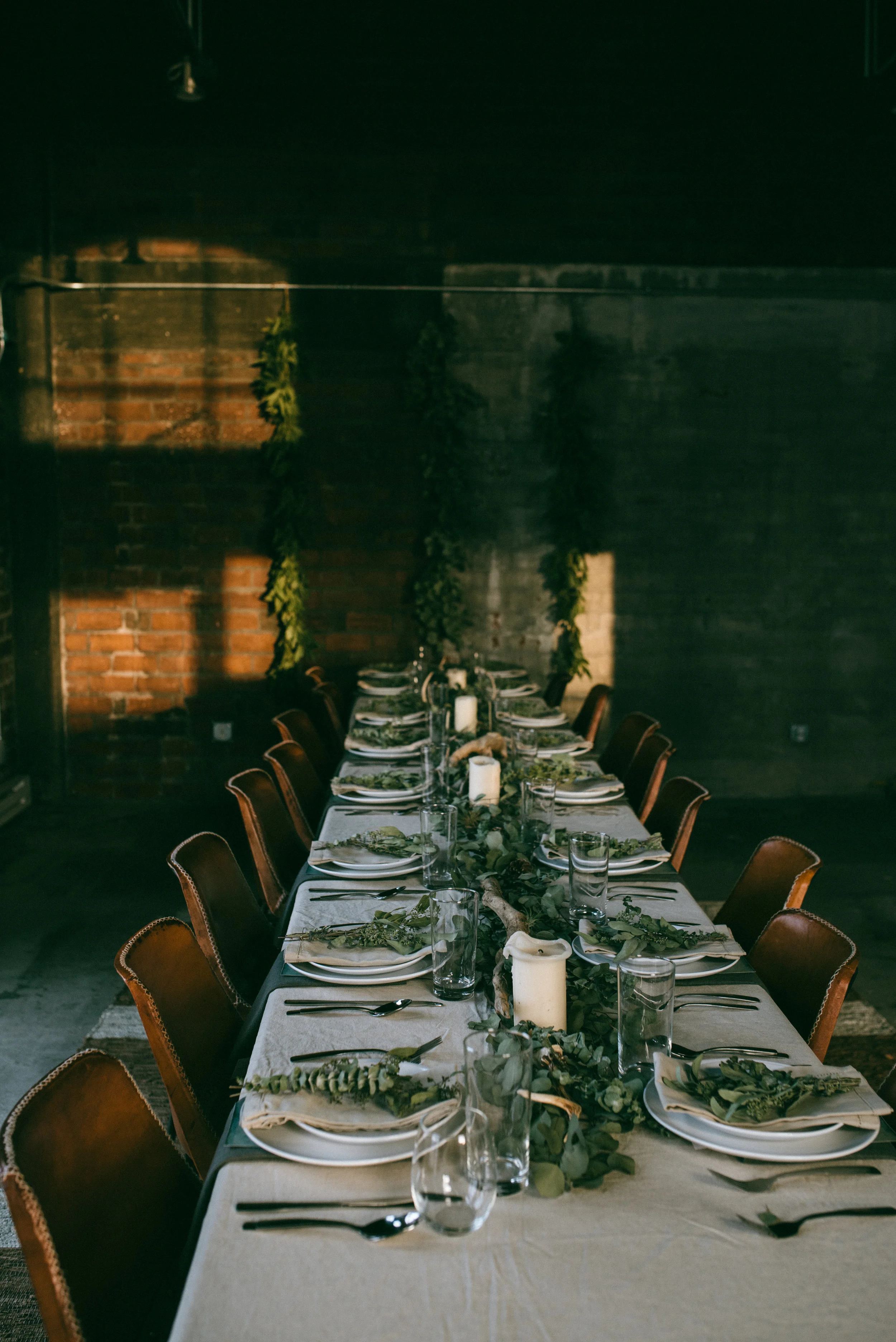
As I mentioned a few weeks ago, I’m starting a new site focusing on local chefs and their favorite meals. I’ve met with a handful of chefs and so far everyone has said yes. Once again, I’ve found people here in the Midwest are so generous with their time and talent.
For the logo, my inspiration was a stamp on white paper, like the kind you’d see from your local butcher shop. I wanted this logo to conjure up images of rubber stamps and old, faded paper. I think we’re so close to that idea! See the logo evolution below.